


 Sundaymail Editor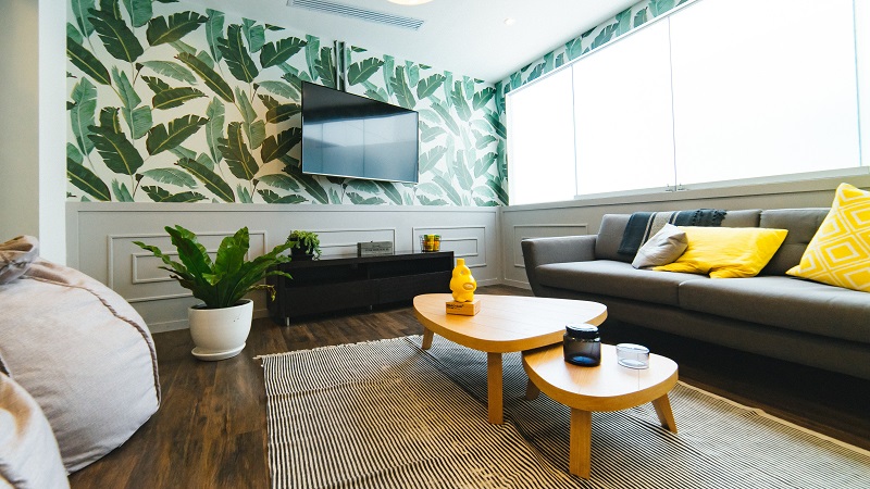
BOLD colours can be tricky to handle when it actually comes down to putting a design together. However, we have compiled a list of our best tips and tricks for handling strong hues in any interior design. Read on below to learn how you can make these trendy shades work in your home.
Consider scale
Paying attention to proportion and scale is an important factor in designing any room, but it becomes especially crucial when you are dealing with bold shades. This is because, in this case, it is possible to have too much of a good thing.
Using too much of one, eye-catching colour in your design runs the risk of feeling overwhelming, rather than like a trendy style statement. Luckily, there is an easy rule of thumb to follow. If you are working with a small space, opt for an accent wall over covering the whole room in one, singular shade.
The same goes for overly large spaces, where there are tons of wall space to cover. Medium-sized rooms, on the other hand, can handle a large punch of colour. Feel free to cover all four walls.
Bring in accent colours
Bold colours work best when they have something to play off of. No colour scheme featuring saturated hues would be complete without one or two complementary hues from the colour wheel. Using too much of one colour, especially when it is a strong shade, can feel overwhelming.
Adding accent colours is a way to break up the room a little while still adding visual interest. When choosing colours, it is important to keep in mind the 60/30/10 rule. In this, you choose one colour— usually your most neutral shade — to be the dominant colour and cover 60 percent of the room. Then you have your secondary colour, a slightly bolder shade, cover approximately 30 percent of the room. Finally, your accent colour, which is your most eye-catching shade, should make up the last 10 percent of the room.
Don’t forget neutrals
When you are working with bold colours, neutrals are your secret weapon. These hues provide a space for the eye to take a respite from the bold colour, leaving room for the rest of your design to be as in-your-face as you would like.
Do not forget to include some neutral shades in various applications throughout your design plan. Usually, in rooms like these, a neutral shade works best as a secondary colour. That said, neutral shades do not have to be boring. There are so many more options to choose from beyond grey, white, black and brown. Metal finishes have the same effect as a true neutral, while still adding an extra layer of visual interest to the space. Gold plays a prominent role in the design. It is used in the table, side table, lamps and accessories. Yet, our eyes are still drawn there when they need a respite from the statement couch.
Add in a dose of pattern
Pattern is the great unifier in interior design. In a room featuring bold colours, you can use it to bring the design together by choosing a pattern that features your shades in a cohesive application.
If you are unsure of which bold colours will go together, picking a unifying pattern is a good place to start building your design. As for where to put the patterns, textiles are always a solid option. Look for patterned rugs, throw pillows and blankets.
Though, if you are looking to make an even bigger statement, patterned furniture will certainly fit the bill. Think about adding in a patterned accent chair or sofa to serve as the focal point of the space. If you love bold colours, there is no reason to be afraid of using them in your design. — freshome



 Bongani Ndlovu
 Online Reporter